
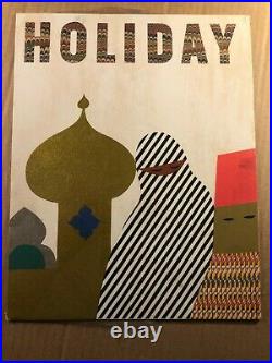


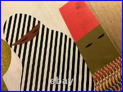
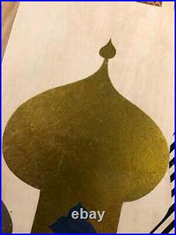

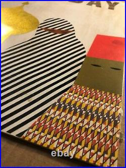
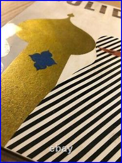
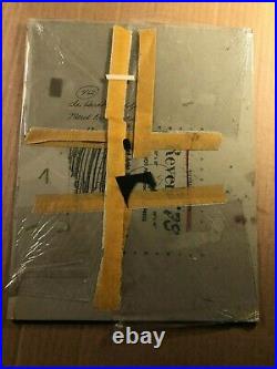
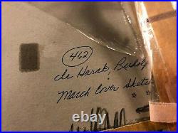

Here is a very rare original cover art design collage for the revered Holiday Magazine from the 1960s by famous artist and graphic designer Rudolph de Harak. Holiday Magazine was celebrated for its graphic design aesthetic and its essays by top world writers. Rudolph de Harak, also Rudy de Harak (1924 2002), was notable as a designer who covered a broad spectrum of applications with a distinctly modernist aesthetic. He was also influential as a professor of design. De Harak was born in Culver City, California. After serving in World War II, de Harak was influenced by two lectures given by Will Burtin and György Kepes which compelled him to pursue graphic design. Along with Saul Bass, Alvin Lustig and others, de Harak helped found the Los Angeles Society for Contemporary Designers before he moved to New York City to become art director for Seventeen for just 18 months. At the same time, de Harak drew illustrations for Esquire and soon began his long tenure in teaching. De Harak served as the Frank Stanton Professor of Design, for a quarter century at the Cooper Union, and visiting professor at Yale, Alfred University, Parsons, Pratt Institute and other schools. He designed a three-story digital clock installed on the exterior of 200 Water St. Previously 127 John St. In New York City. The clock consists of “72 square modules with numerals that light according to date, hour, minute and second”. He also designed a neon-illuminated entrance and a scaffold covered with brightly covered canvas outside. De Harak was a member of the 1989 Art Directors Club Hall of Fame. He was the recipient of a 1992 AIGA Medal. His many prominent projects included the timeline and typographic displays for the Egyptian Wing of the Metropolitan Museum of Art and the futuristic entryway for the quirkily embellished office building at 127 John Street in Lower Manhattan. Dimensions: 10 1/2″ by 13 1/2″. De Harak’s graphic and environmental designs for public and private institutions and exhibitions were rooted in European modern rationalism but used a playful American vernacular. His design for the John Street entrance and facade transformed this cold glass and steel building into a carnival through brightly colored canvas-covered scaffolds that serve as both shelter and sun deck, a three-story-high digital clock made of 72 square modules with numerals that light up the exact date, hour, minute and second, and a sci-fi-inspired neon-illuminated tunnel leading to the front door. For the centerpiece of the Cummins Engine Museum in Columbus, Ind. De Harak conceived a display he called an”exploding” diesel engine; it hangs by wires in midair, revealing its every part, including all the tiny nuts and bolts. It was one of his many approaches to extracting useful, fascinating information from the most minute details. His photographic timeline and information signs and panels for the Metropolitan’s Egyptian Wing, commissioned by the architect Kevin Roche, are still in use after two decades. This project combined his lifelong passion for clear communication and elegant typography. The project involved exhaustive research of every nuance of the magnificent collection and took 10 years to complete. Rudolph de Harak was born in Culver City, Calif. On April 10, 1924. While he was in his preteens, his family moved to New York City, where he attended the School of Industrial Arts. Finding it hard to earn a living, he moved once again to New York in 1950. He took a job as promotion art director of Seventeen magazine and later started his own small design office in 1952. At the time Mr. De Harak did illustrations for Esquire, collages consisting of photographs, drawings and found materials that he referred to as jazzlike improvisations. Not coincidentally he used this same method when designing jazz album covers for the Columbia, Oxford, Circle and Westminster labels. He once said about his design method,”I was always looking for the hidden order, trying to somehow either develop new forms or manipulate existing form.’ The nearly 350 covers he designed throughout the 60’s for McGraw-Hill paperbacks, with subjects like philosophy, anthropology, psychology and sociology, offered him a place to test the limits of conceptual art and photography. He used the opportunity to experiment with a variety of approaches inspired by Dada, Abstract Expressionism and Op-Art. His McGraw-Hill paperbacks, especially, had a strong influence on contemporary graphic design. Not content to work in one medium or genre, Mr. De Harak created exhibitions, including a celebration of American sports for the 1970 Osaka World’s Fair. He had commissions from the Atomic Energy Commission, the National Park Service, the National Endowment for the Arts and the United States Postal Service. His spirit of restlessness carried over to his own firm.’He would build up an office and fire them all, and then he’d start up again,” the designer Thomas Geismar of Chermayeff & Geismar recalled. De Harak taught graphic and exhibition design at Cooper Union for 25 years and was a visiting professor at Yale, Alfred University, Parsons School of Design and Pratt Institute. In 1993 he received a medal for lifetime achievement from the American Institute of Graphic Artists. He is survived by his wife and two sons, Bruno and Dimitri, and three stepsons, Doug, Jon and Mark Sylbert. He played jazz saxophone and made and exhibited paintings that were hard-edged geometric forms, which, he said, were not abstract”because geometry is as real as faces and landscapes. The item “Rare Original Holiday Magazine Cover Art Design Famous Rudolph de Harak 60s” is in sale since Sunday, October 11, 2020. This item is in the category “Art\Paintings”. The seller is “pengang” and is located in Marietta, Georgia. This item can be shipped worldwide.
- Subject: Holidays
- Originality: Original

